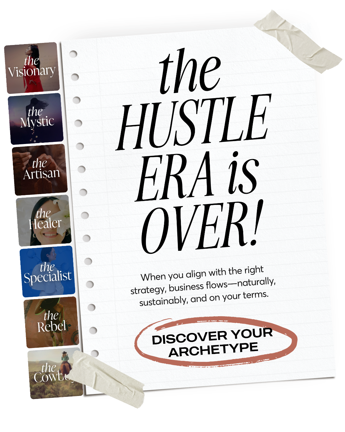
Inspired by this branding story?
I’ve spent over a decade helping bold entrepreneurs ditch the branding guesswork and build businesses that actually fit—all while living life on the road, chasing freedom, and designing from anywhere.
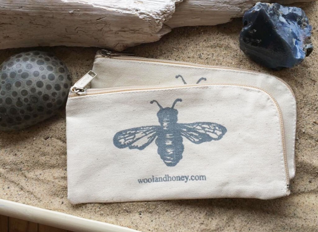
The Northern Michigan yarn shop hired Live Large Design to do a full brand redesign and overhaul. They wanted a more visceral logo that would relate better to their hand-dyed yarn and local natural surroundings. Additionally, they needed a cohesive brand platform to support the interior design of their brick-and-mortar store and monthly yarn membership.

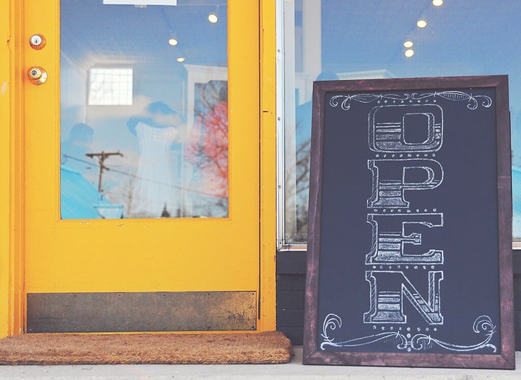
After many iterations and concepts, the Wool & Honey final logo was created from a hand-illustrated beehive, balanced yet natural. As a vector logo, it is versatile for any application, including a custom made wooden sign. Included in the project, was a comprehensive brand guidelines document, which defined font and color palette selection. These were implemented throughout the physical store and other assets, creating a cohesive brand presence.
After a solid brand foundation was developed, we delved into a variety of collateral design. This is often the really fun part of a project since all the research and intention of the branding gets to come alive in numerous design pieces. We created secondary graphics to diversify the brand and then moved into designing patterns, tags, labels, and more!
In less than 6 months, Wool & Honey more than made back their original investment with the brand redesign.
After a launch party at their newly designed store using the brand guidelines Live Large Design created, they have continued to increase their reach and presence in the knitting community worldwide. They now have over 23,000 Instagram followers in addition to their local presence and regularly sell out of their products.
See More Success Stories


Get started today before this once in a lifetime opportunity expires.