
Inspired by this branding story?
I’ve spent over a decade helping bold entrepreneurs ditch the branding guesswork and build businesses that actually fit—all while living life on the road, chasing freedom, and designing from anywhere.
Ocean Acidification Research Center (OARC) provides support and analytical services for groups who are monitoring ocean acidification.
It was up to Live Large Design to create an identity that would allow OARC to be recognized as an individual identity within the bigger framework of the University of Alaska. They wanted to stand out visually with their work and impact.
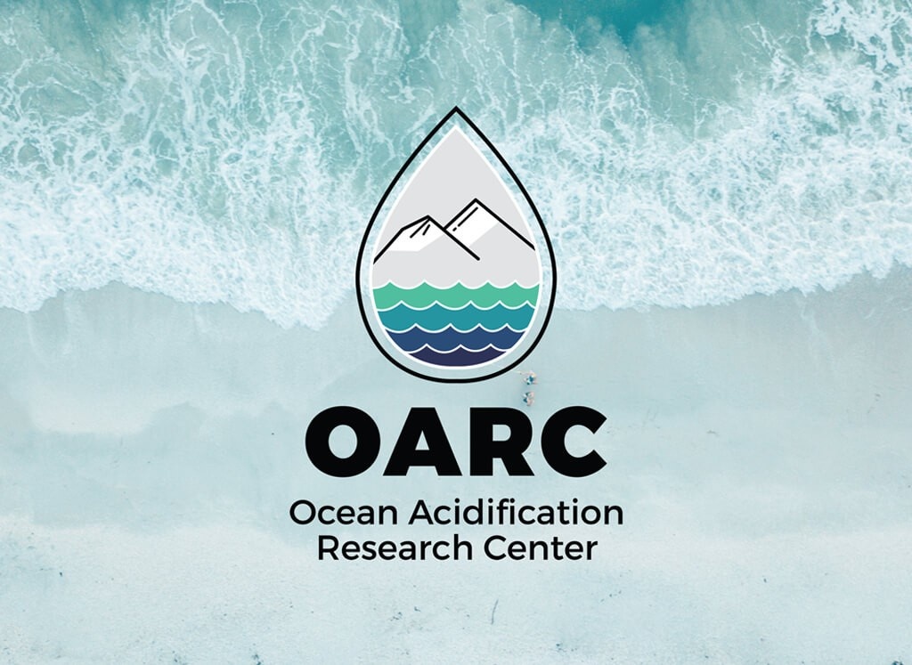
Live Large Design developed a visual identity that incorporated all the elements that contribute to OARC’s research. The design encompasses important visual elements of Alaska, including mountains, snow, and the ocean.
A strategic font selection was used to demonstrate the strength of the organization, and the color palette is grounded in nature and water.
Overall, the visual identity brings together the foundational history of OARC and its importance in today’s world in a modern approach.
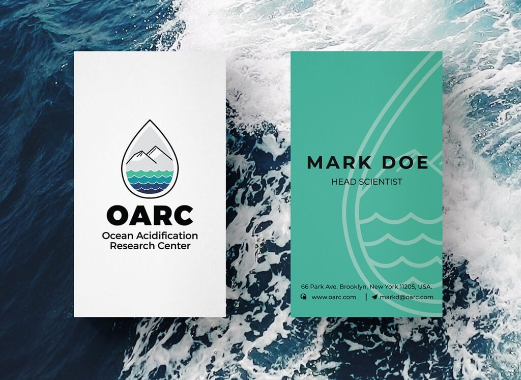
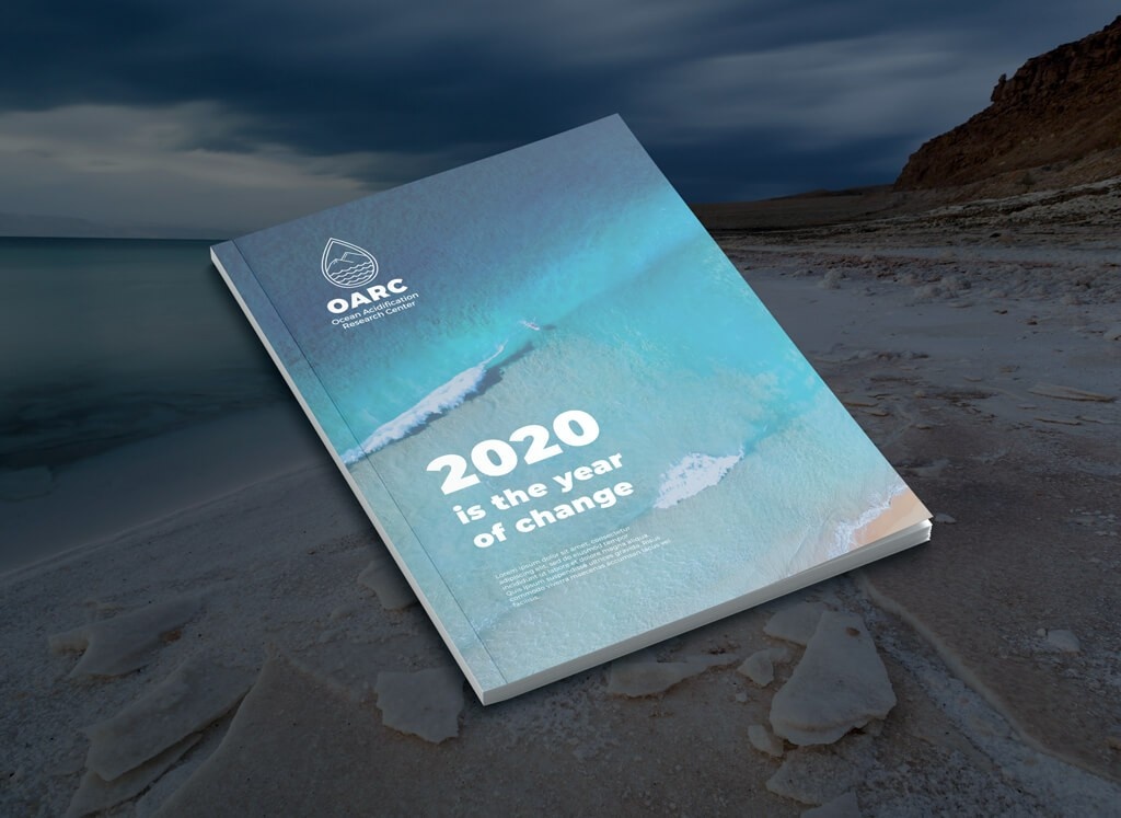
After a solid brand foundation was created, these elements were easily carried through to additional design pieces, including business cards, banners, and fliers.
The brand guidelines created for OARC ensures that all current and future design materials are created to support the identifiable and consistent brand.
OARC fully embraced their new branding, allowing them to establish their own identity within the University of Alaska structure.
OARC remains a trusted research component in the global ocean climate. The organization has gone on to showcase its brand and research, drawing international attention and awareness.
See More Success Stories


Get started today before this once in a lifetime opportunity expires.
